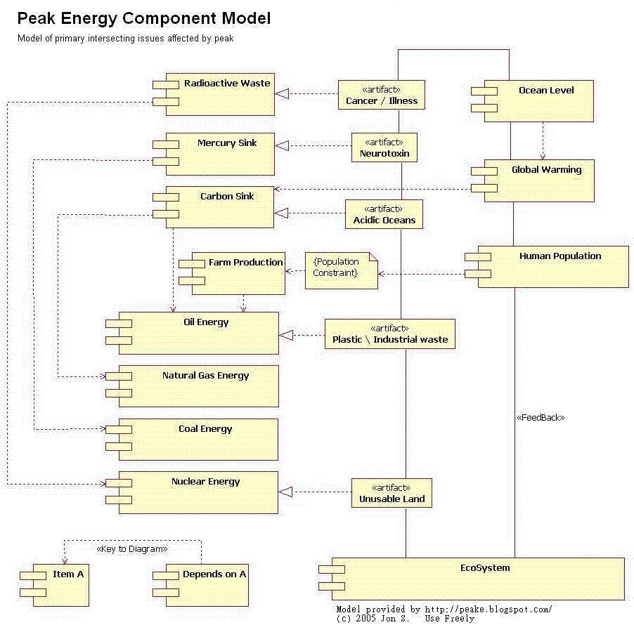
Modeling the Peak
It is hard for me to keep track of everything dependant on Peak Energy, so I have been thinking about different ways to model associations and relationships of the systems involved.
My first run at this uses UML, perhaps not the best choice. If anyone can recommend a better way to do this, please let me know in the comments section.
A couple of points about this -
I've left out a few components - Fresh Water, Resource War, Renewable energy. Also, these items are more interelated than I have shown. But it would be better to break the model into multiple models rather than to try and make a large, confusing one. Actually, the model above is kind of shaggy anyways.
Ultimately I'd like to see Peak Energy modeled like the weather - where small trends lead to a multiplicity of possible outcomes, but large trends (here I would compare the jet stream to depletion) lead to overarching, predictable results.
In my copious spare time.
posted by JMS @ 2:33 PM
2 comments
![]()
![]()
2 Comments:
Have you ever used the graphviz/dot package from http://www.research.att.com/sw/tools/graphviz/ ?
This automatically renders directed graphs from net lists, generating gifs, png, jpgs, etc.
My opinion of UML is summed up by one of the candidate standards for UML 2.0 which was entitled "Unambiguous UML".
Thanks for the link, I hadn't seen that software before. We're diving into agile development where I work, and it turns out you can't make software without UML diagrams. - pause -
More seriously, I think I have two goals.
One is to generate some kind of iconic, user friendly representation of Peak Energy, so that a wide variety of people can see in one place what a "deep", interconnected issue it is. This doesn't necessarily require a formal modeling language at all.
Second - on a slightly more technical level, model everything conceivable and then try and boil it down to the essence.
Post a Comment
<< Home